Case Study: AbleDesk.
UX Design for a Ticketing Service Web App.
ABOUT THE PROJECT
Ticketing systems play a vital role in helping IT professionals manage their daily workload. A ticketing system allows businesses to effectively handle incidents and requests from clients, track status, communicate responses/alerts, and document the life cycle of the ticket. To help IT professionals, I decided to improve the functionality and design of their ticketing system.
Project Overview
Role:
UX & UI Designer
Tools:
Figma • Miro • Google Drive • Google Meet • Pexels • Zoom
Timeframe:
March 2022 - July 2022
Problem
Ticketing systems could include many features that can be overwhelming to use. This could mean that some important features could be hard to find which could impact the user’s efficiency.
Solution
A simple ticketing simple that includes all the important functions that users need to use daily.
The Problem
Ticketing systems could include many features that can be overwhelming to use. This could mean that some important features could be hard to find which could impact the user’s efficiency.
Problem Statement
Some of the ticketing processes such as timekeeping, note-taking, and communication are inefficient and have a high possibility for errors. This could mean that ticketing processes take a long time to complete. There is an opportunity to increase the efficiency of the ticketing process, therefore, increasing the satisfaction of their clients.
Secondary Research
First, I must gather initial information regarding ticketing systems. What are the important factors of a ticketing system, and the pros and cons of it? To achieve this, a Secondary Research was performed. The following are the result of this.
Factors of a ticketing system that affects professionals
Communication
Detailed record-keeping
Errors
Improved tracking of ticket statistics and data
Integration with other systems and services
Alerts and notifications
Speed and responsiveness
Pros
Organize high volumes of requests in a centralized system / Better communication / Detailed record-keeping / Improved tracking of ticket statistics and data / Integration with other systems and services / Increase employee efficiency and productivity / Less stress
Cons
Difficult to implement / Lack of knowledge base / Learning curve / Cost
User Interviews
I conducted a total of 5 user interviews to have a better understanding of what users want and expect from a ticketing app. I carefully organized the results of the survey I conducted and selected the participants based on their professional, age, and experience using any similar product. I then reached out to the participants via email and conducted the user interview through Zoom video calls.
Takeaways from the interviews:
Users have difficulty entering accurate time and they wish to have an onscreen timer.
Most users want to be able to view ticket notes easier for tickets with a long list of notes.
Users like to have the ability to upload files that are related to the ticket.
Searching tickets could be difficult due to the lack of filters.
Users want an easier way to add, remove and select users that will receive their messages or updates.
User Pain Points:
Time-keeping: Users spent additional time manually entering or correcting inaccurate recorded time.
Ticket notes: Users need to be able to sort notes based on their categories.
Communication: Users want to be able to add/select users that need to receive their email or updates.
Affinity Map
The information gathered from the user interviews is then sorted into an affinity map to help organize all the information.
Findings from the affinity mapping:
• the hardest part is accurate timekeeping
• most users have an issue with timekeeping
• most users have an issue with timekeeping
• uploading files within a ticket is essential
• an on-screen timer can help users track time
Personas
Goals
How might we provide IT professionals with better ticketing system features so that they can perform their tasks more efficient.
How might we create a better timekeeping process that will provide an easy and accurate timekeeping tool for the users.
How might we simplify and organize note-keeping to enhance the overall note-keeping experience.
User Stories & Highlights
Here are some user stories that focus on the specific needs of users who want an efficient ticketing system for their daily work use.
Here are the highlights:
User Flows
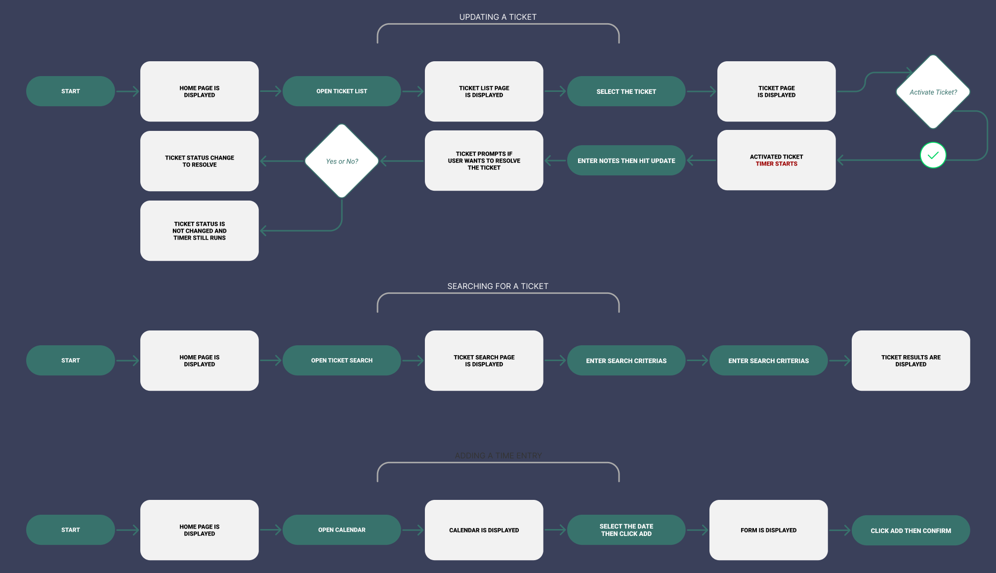
Based on the user stories and highlights, I created user flows that show the path the user will go through to perform each task. There are three user flows: Updating a Ticket, Searching for a Ticket, and Adding a Time Entry.
Updating a Ticket shows the user’s path that the user will take which includes activating the ticket, entering a note then updating the ticket, and closing the ticket.
Searching for a ticket includes searching for a ticket using specific criteria.
Adding a Time Entry lets a user add a time entry by going to the calendar and adding the time.
Site Map
Based on the insights gained from competitor research, and user research, I constructed a sitemap to help guide the user flows.
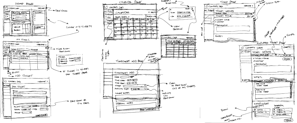
Sketches
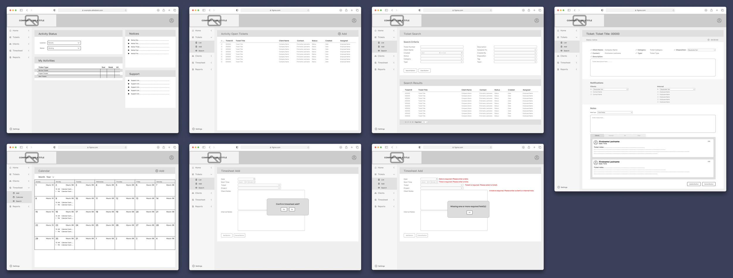
Taking inspiration from many competitors and other similar systems, I quickly sketched a few pages to address what the users' wants and needs uncovered in my research.
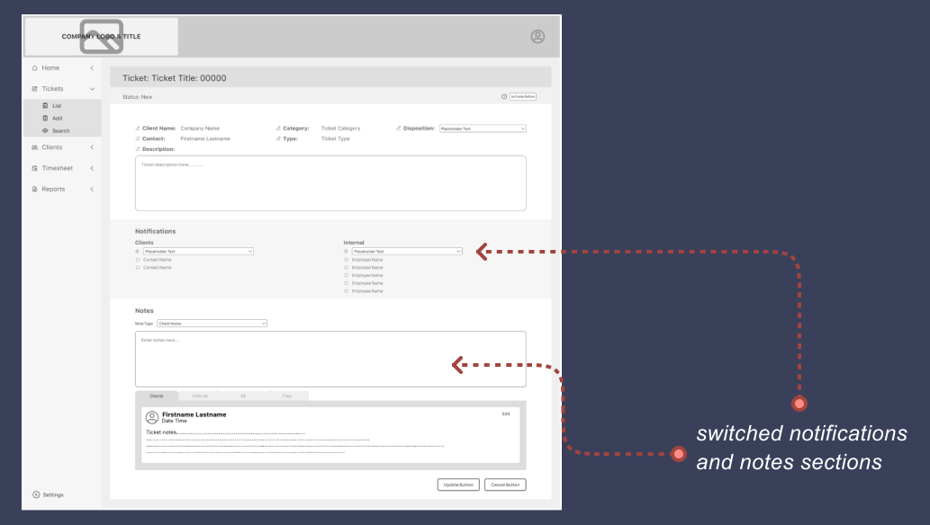
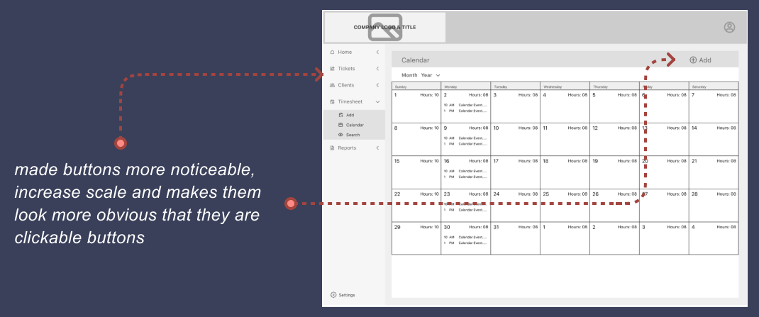
Using the sketches above, I performed several guerilla tests which resulted in some changes when I created the wireframes. Here are some of the results of my guerilla tests.
some users did not like the position of some elements in the ticket page. As a result, I changed the position of some sections.
some users had a hard time distinguishing which elements are buttons or clickable. As a result, I added icons to the text.
More wireframe of the other pages…
Style Guide
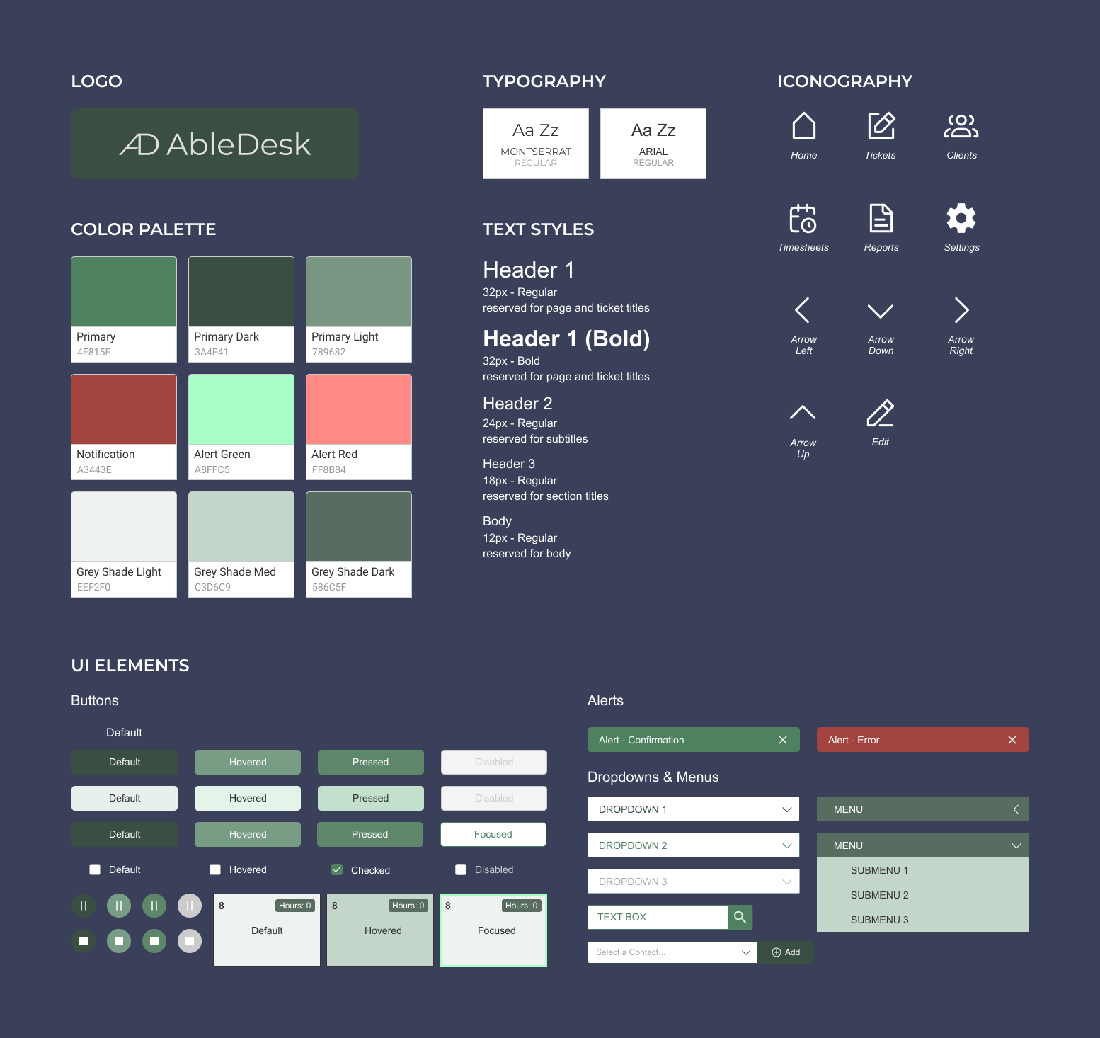
I developed the visual design by iterating from mood boards, and UI kits. The colors I selected are associated with productivity, energy, and balance to provide a positive feeling to users. I chose the name Able which is an acronym for Achieving Better Life Experience to send a message to the users that our goal of making their experience better by using the product. The icons and UI elements are designed with simplicity and functionality in mind to provide a satisfactory user experience.
High Fidelity
From wireframes to high fidelity designs - the high fidelity designs were created using Figma - the designs below are for the following pages: Dashboard (Home), Ticket Page, Ticket List, Ticket Search Page & Results, Calendar, and Calendar Entry.
Prototype
Using Figma, prototypes were creating from the high-fidelity designs. In the video you will see three scenarios. First, the user opened and then updated a ticket, then after the user searched tickets assigned to another employee. Lastly, the user opened the calendar and added a time.
Usability Study & Changes…
A usability test was performed with five users remotely via Zoom and Teams video call. The issue that most users come across when using the system was that some buttons were difficult to find.
Changes that was the result of the test…
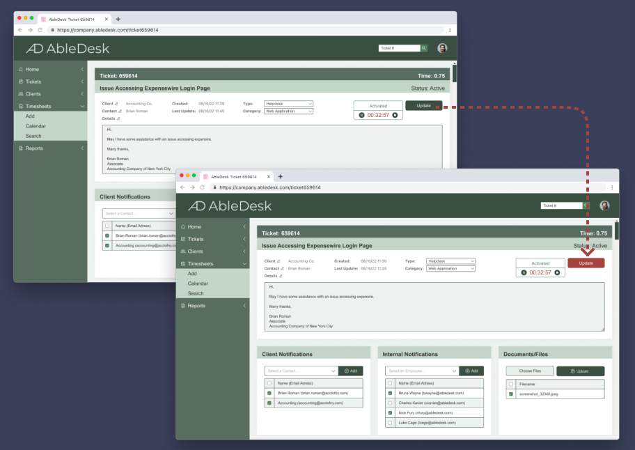
to make the UPDATE button more visible and noticeable, I changed the color from GREEN to RED. The color red was chosen because it symbolizes STOP. This resulted to a better result in the second usability test. Another UPDATE button is added at the end of the page to provide users easier access to update the page.
The prototype below shows the design after the changes have been implemented. You can see that the Update button is in an inactive state when the notes box is empty and turns to an active state when a use enters something into the text box. You will also see the additional Update button at the bottom of the page. This will allow the user to just use this button to complete the update without having to scroll back up which makes the experience better for users.
Another usability test was performed after the changes. There were no major issues and so no further changes were needed.
Final Prototype
The link to my final prototype is posted below. Feel free to test it and if you have any comments or suggestions, please send me an email. My email is located in the contacts page. To view the entire page, you can either click Options then Fit to screen or the Expand button next to Options.
Lessons Learned
Focusing on your audience and not your design…
In the early part of my project, I spent hours upon hours obsessing over icons, buttons, etc., and going crazy over every little details. I set my expectation high thinking that users will easily use my design. After testing and seeing how users had some difficulty using and navigating through my design, I realized my expectations were wrong. I felt shocked that all my hard work of making my design great (in my eyes) did not met the needs of my users and I almost forgot the goal of my project.
What I learned during this project are…
Never forget that you are designing for your users and always ask the question “does this meet the needs or my user?”
Having feedback during testing is a good thing. Do not be discourage when users criticize or did not like your design
Next Steps…
Improvements to the calendar and more features can be added in the future.
Add more features
Perform additional usability tests to identify pain points and then make changes to improve the design


